BtoB shop experience
Summary
Orange is one of the largest operators of mobile and internet services in Europe and Africa and a global leader in corporate telecommunication services. During 2 years, I redesigned the entire BtoB e-commerce website following the process below.
Step 1 : Understand 🤔
We put ourselves into users' shoes and understanded their likes & dislikes, context, needs, pain points, etc. Meanwhile, we learned about the business:
• What is the money-making model?
• What are the metrics to measure business success?
• What are the challenges? What product cycle we are in?
What we've done:
- Made quantitative analysis with Google Analytics and Content Square.
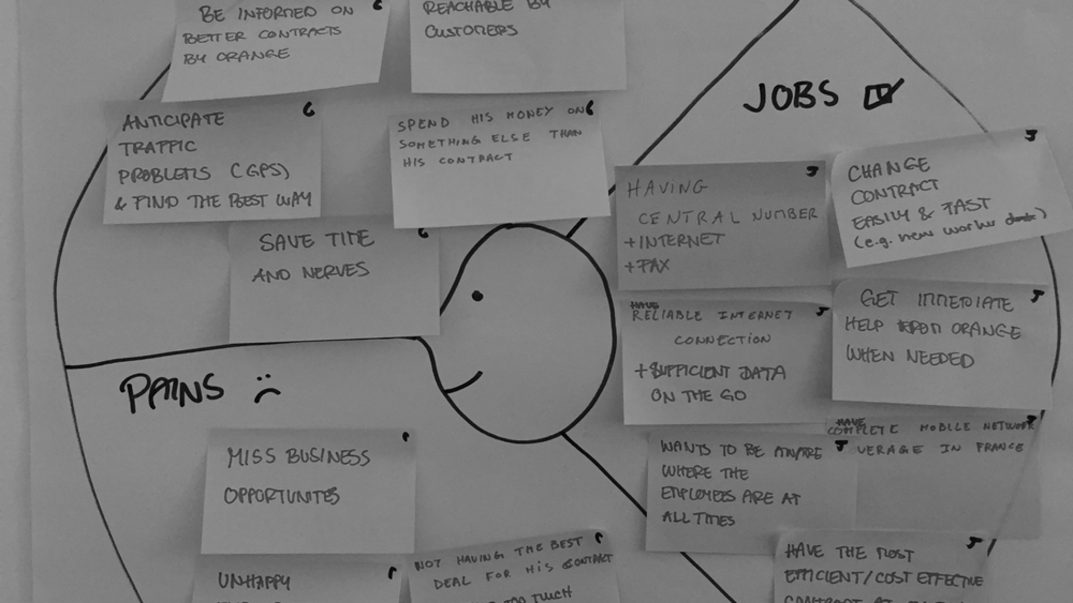
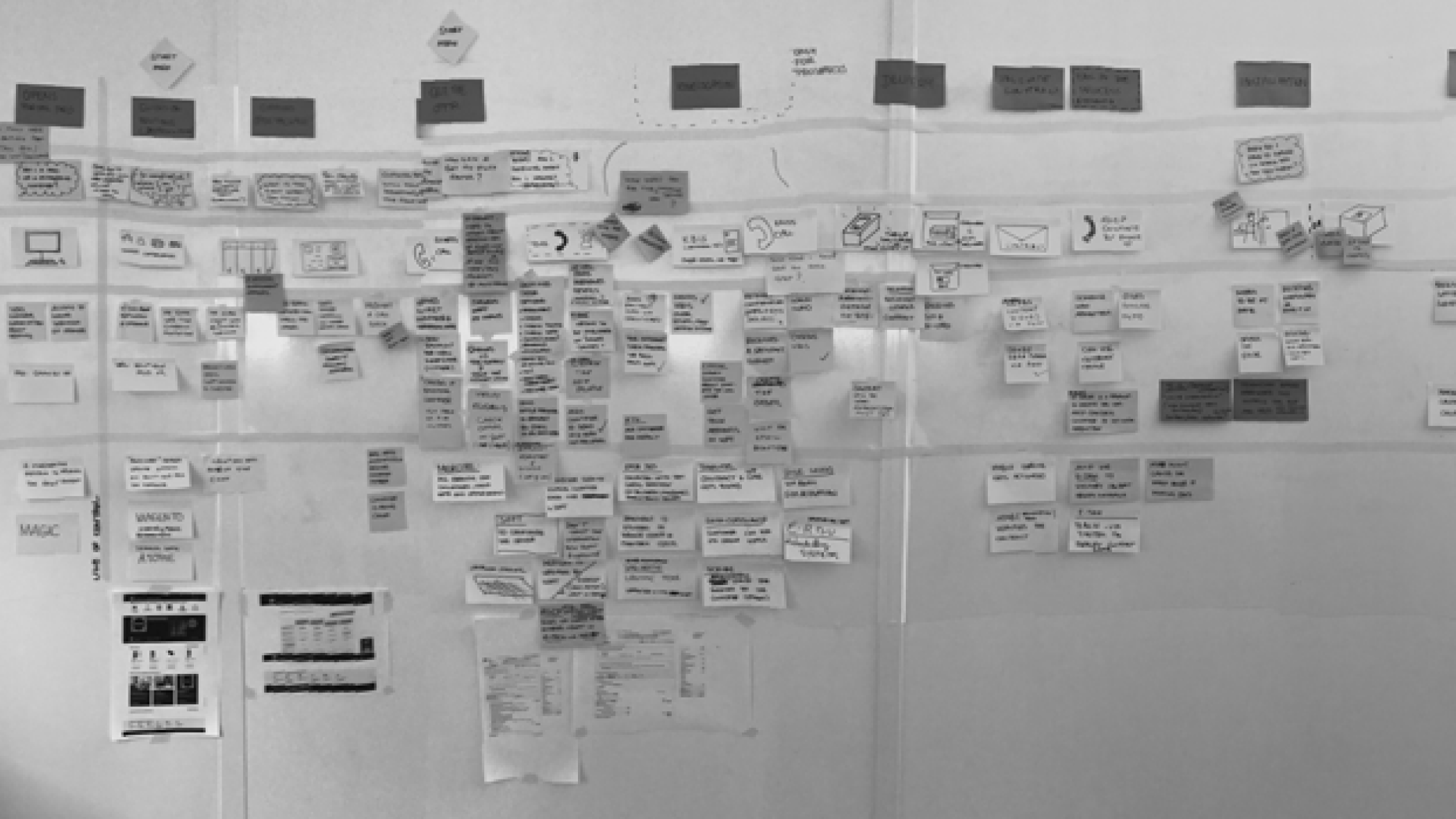
- Made qualitative analysis by organised focus group, created empathy Maps, card sorting and moodboards during workshops.
Step 2 : Define 📙
We worked with the team, especially the product manager to discover problems and opportunities. The ability to gather insights and synthesize data and abstract input to a problem is very important.
What we've done:
- Defined our target users profiles : demographic informations, needs, goal, challenges, frustrations and pain points by making persona.

Step 3 : Ideate 💡
We came up with ideas that create a win-win situation for both users and businesses. And involve the team in this phase so everyone could contribute with their own expertise. We made sure the ideas are planned and will land on the product eventually. Also, we thought about how to measure success.
What we've done:
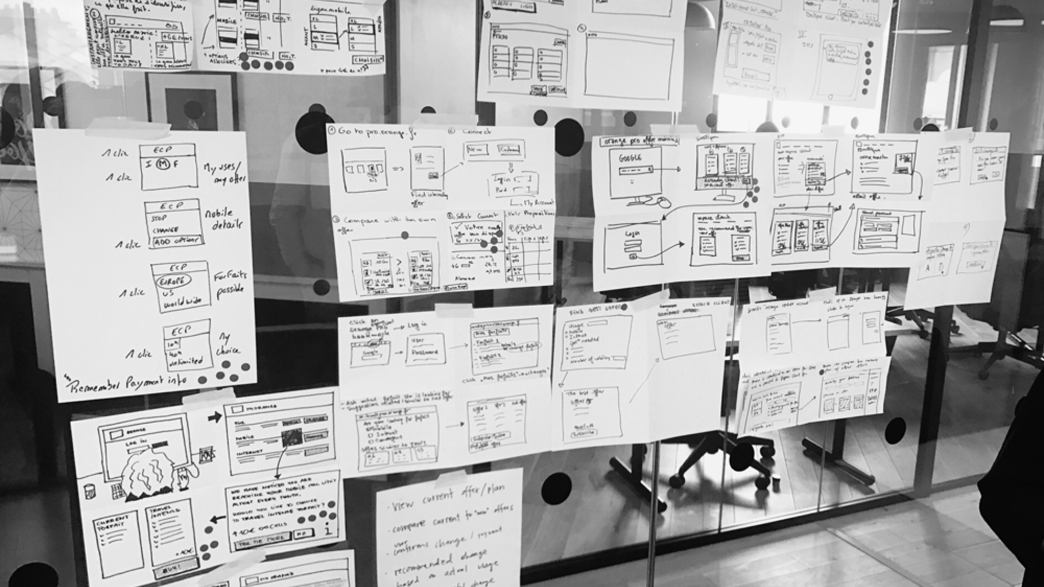
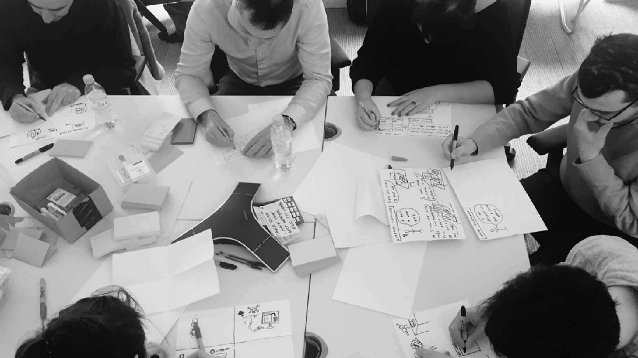
- Organized brainstorming big ideas, design sprint, crazy eight and service blueprint workshops, and dot voting with the team (PM, PO, Developers and Marketing managers).
Step 4 : Execute ✍️
It's about making and communicating. Theoretical knowledge is the base, empathy for users is the must-have, and feedback from Developers or others helps us succeed. We Organized a handover meeting with developers, and presented a well-thought-through flow with all coroner cases and a lively prototype.
What we've done:
- Helped and contributed to build a design system for all the Orange Group digital services.
- Created visual responsive design, collaborated and paired with developers.
- Made path prototypes.
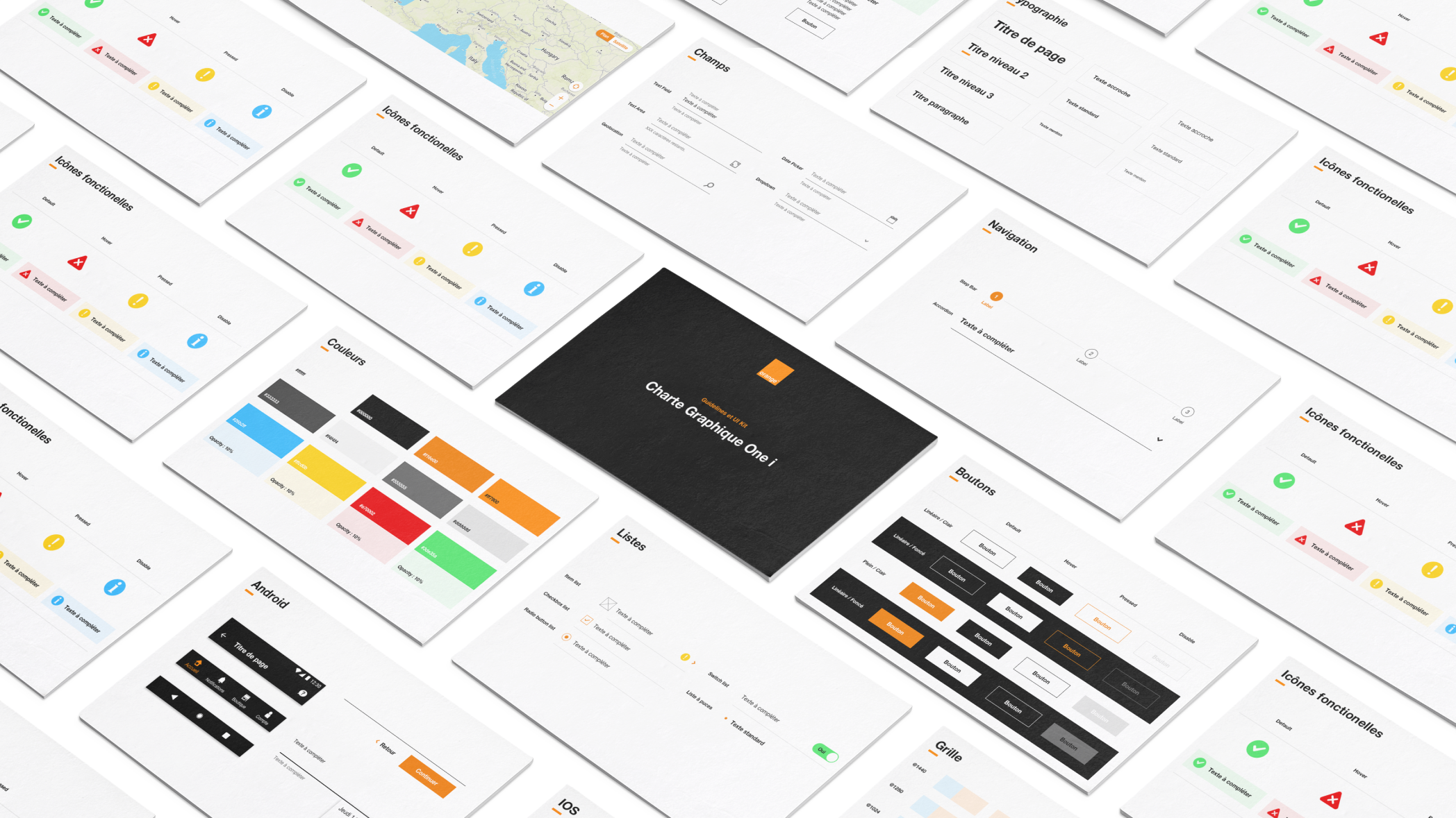
One i Orange design System
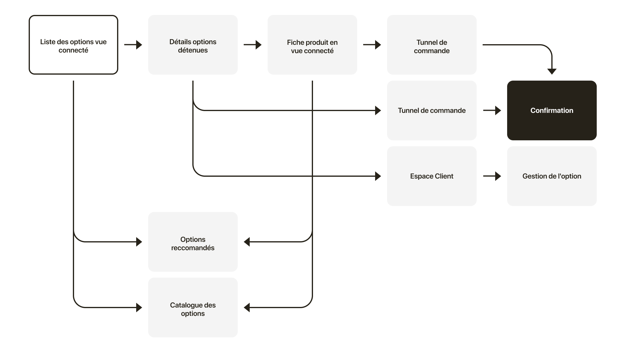
Purchase user flow
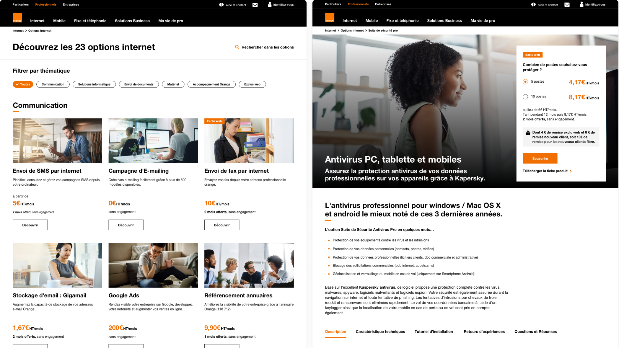
Market place & product page
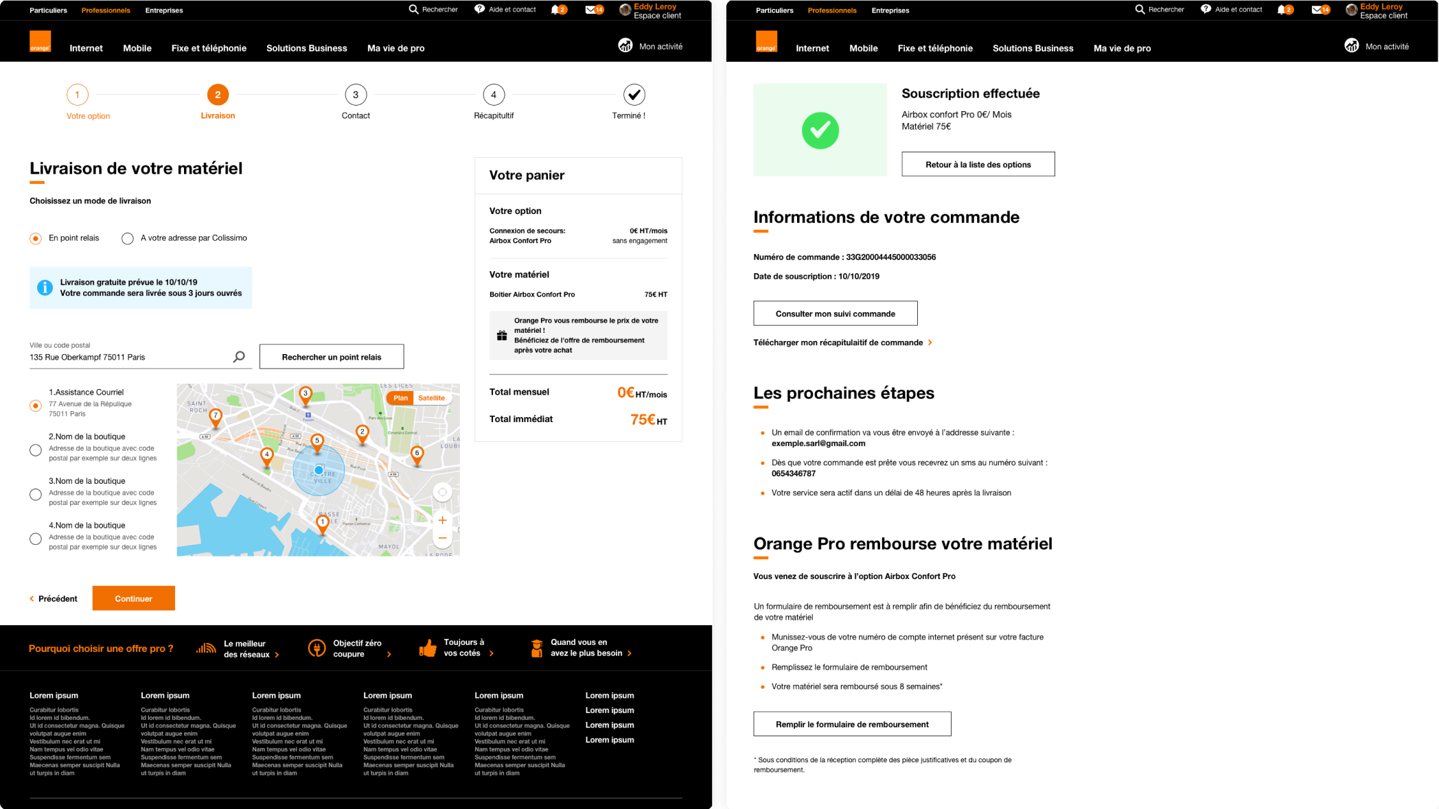
Purchase flow
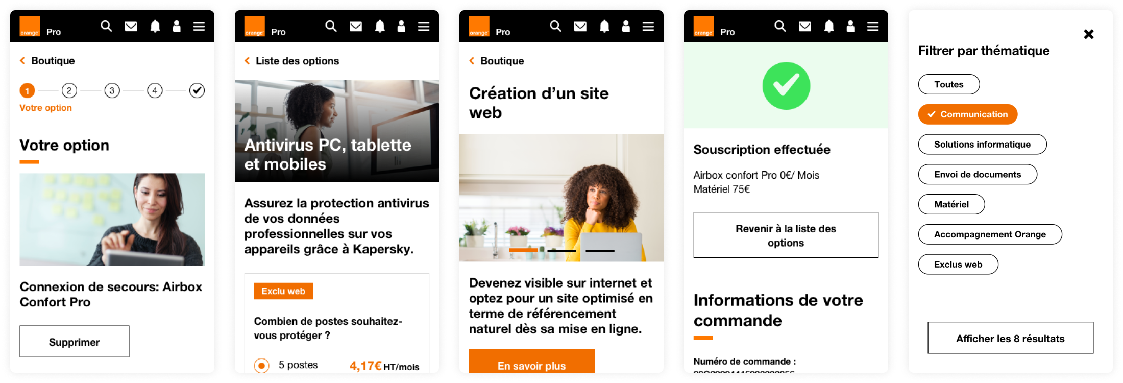
Responsive mockups
Step 5 : Validate ✅
Besides looking for what we predicted, we also payed attention to other metrics or feedback. We made sure that qualitative study is part of the procedure at the beginning so that you have a solid ground to advocate for your users. Never forget to follow up after the validation:
• What we could improve?
• What will be the new opportunities?
• Did we need more validation?
What we've done:
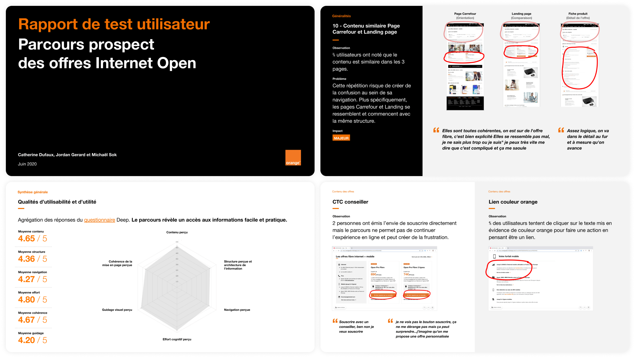
- Made quantitative analysis with A/B testing, Content Square and Google Analytics.
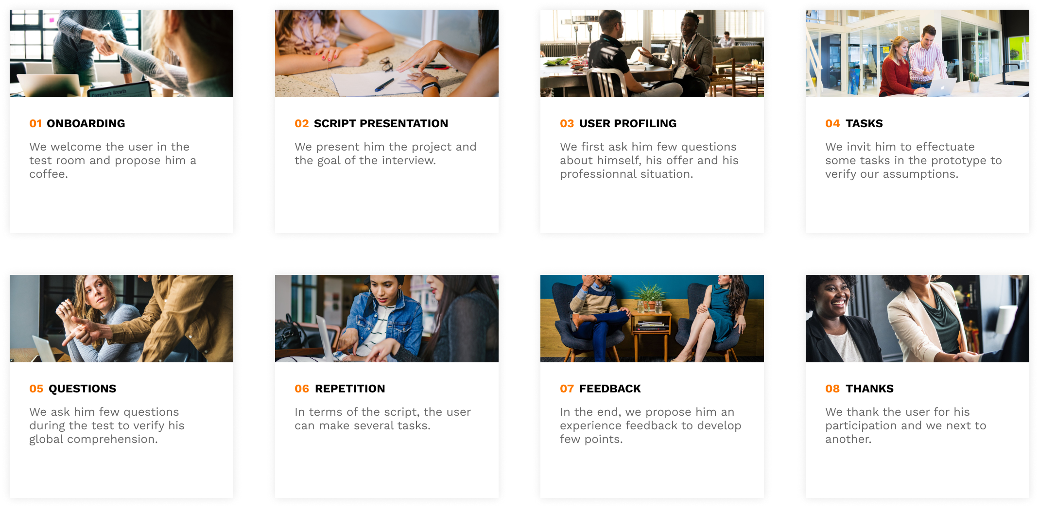
- Made qualitative analysis with users usability test.
